
J O E A N E P A S I
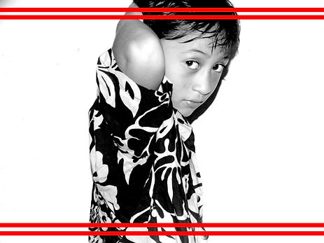

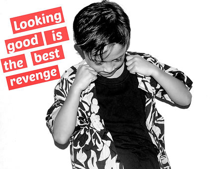

Image 1:
This is one of my best chosen images. Why, because the way the model is looking straight at the camera, its making him the focal-point of the image. If you look at the image he is in the centre which is the middle and the reason why the model has been placed in the middle is because so the viewer will notice the main subject that stands out in this image overall. If you look at the models shadow, its very bold and nicely shaped, and the background is pure white. What I did was I changed the contrast of the image and faded out the background so it'd be all white. I did this on photoshop to just show the back and white of the image and thats something I have used from the Artist I have researched, which is Barbara Kruger. The way she uses black and white images and the red around the border. For me, it''s the red that makes the image stand out because its bright for the image and it will catch the viewers eyes aswell.
Image 2:
This image is my 2nd best image from the four that I've chosen. I have chosen this image because the way the model is close up infront of the camera. You can see he's not in the middle but leaning on the left side gazing right into the lens of the camera letting the viewer know that the model is the subject of the image. What I like about this image is the shadow that is reflected on the on background, its effective and plus it looks as if it's been shot in a studio. I edited all 4 images on photoshop which was just for thr lighting, trying to get that black and white look and balancing each image with the others. Another idea I used from Barbara Kruger was the quotes on her images but what i did was relate the quotes to the models stance, so they are balnaced.
Image 3:
This is my 3rd best chosen image. The reason why I have chosen this is because Barbara Kruger also has an image like this, meaning the way the model is posing at the camera and I like how the model is posing aswell, its cheesy aswell. Another thing that I like about this image is how the model is standing and posing on an angle, he is tilted and its his arms on the side that are leading lines to the models stance. His stnace doesn't look awkward and its very natural. You can see that I've used Barbara Kruger's technique which is the quotes, the quotes relate to the models pose and its the red that makes the mage stand out. If you look at the quotes , you 'll notice that the lettering I also tilted on an angle and the reason for that is because the models pose is what lead me to do this, as I've quoted the model on a leaning angle.
Image 4:
This is my 4th best chosen image. The reason why I have chosen this image is because the model looks relaxed in the image. Models stance is on point and the quote in the image relates to the models pose, you can see that he is trying to act cool and grown by the way he is holding his collar. What I like about all these images is that the lighting to all similar to eachother, there all balanced the same and thats the connection all 4 images have. Also the thing that I've used on all four images to edit was Photoshop. What I did with Photoshop was filtered the images with black and white and contrasted it to the right levels so it matched each image, just so the other images werent too dark or too light but just right. Another thing I've used on all four images was the bright red that Kruger uses, reason why I've used this is because its one thing that makes the image so creative and fascinating. You can also see that I've used the quotes which is Krugers technique aswell, the quites relate to he models pose and what he's doing in the image.